Re-designing an e-commerce with the users in mind
The Mission
QWSTION is a brand focused on making sustainable bags and backpacks from banana plants using their own trademarked open source technology called Bananatex™.
From the difficulties of using this website we dug into research to find a better way to tell their story.
We explored the complexity of their navigation, and broke it down into chunks of information that could help the users not only to make purchases, but also to learn more about this fantastic material.
Services
Audit / Research / Web Design / Webflow Development
Website
qwstion.com
@qwstionstore
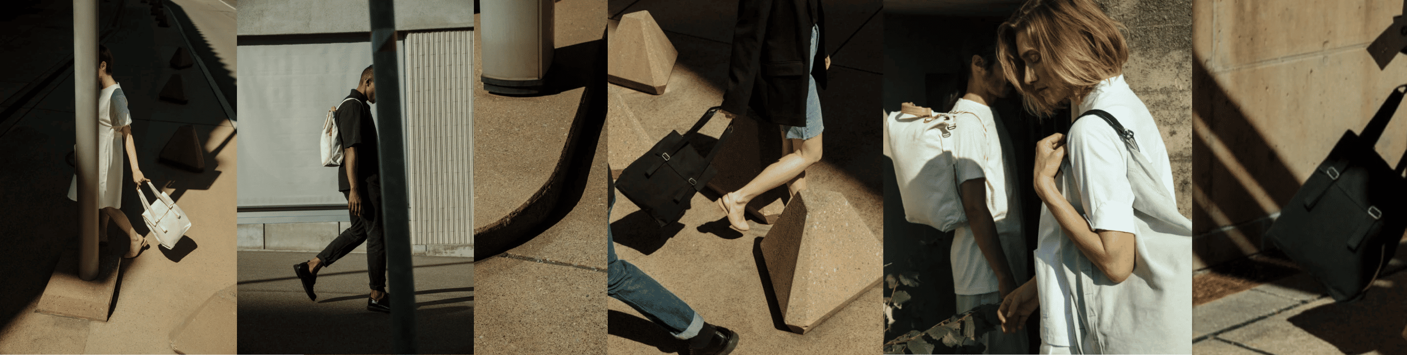
fig 01. Brand Aesthetic
Clearing the path
First things first, we created a screen-by-screen sitemap with current links from the website to audit how the navigation was happening. In this instance we identifyied the biggest issues that the users were facing and we started to isolate them to work properly on them afterwards. We got a clearer view from this audit and now we were ready to get our hands on it.
This method allows us to identifiy every possible interaction and not leave it to chace.
We also dug into the brand’s positioning, its competitors and their communications in order to build a database on how the brand acts, looks and speaks to explore how we could improve it.

fig 02. The Sitemap
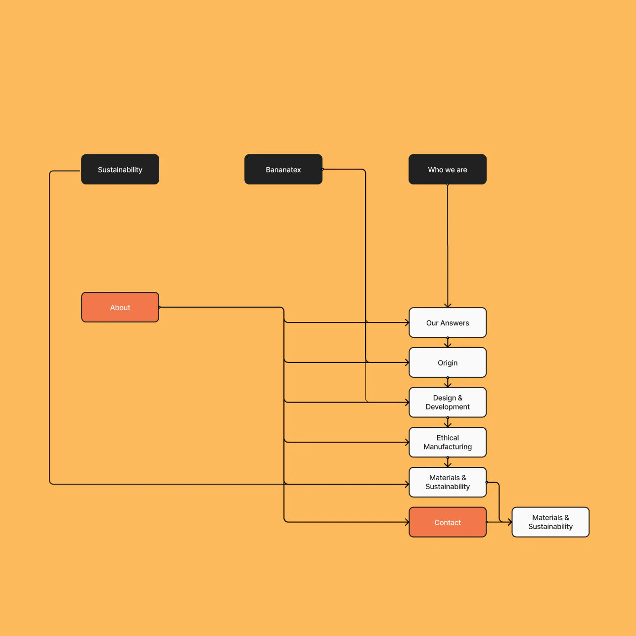
fig 03. Redundant Links
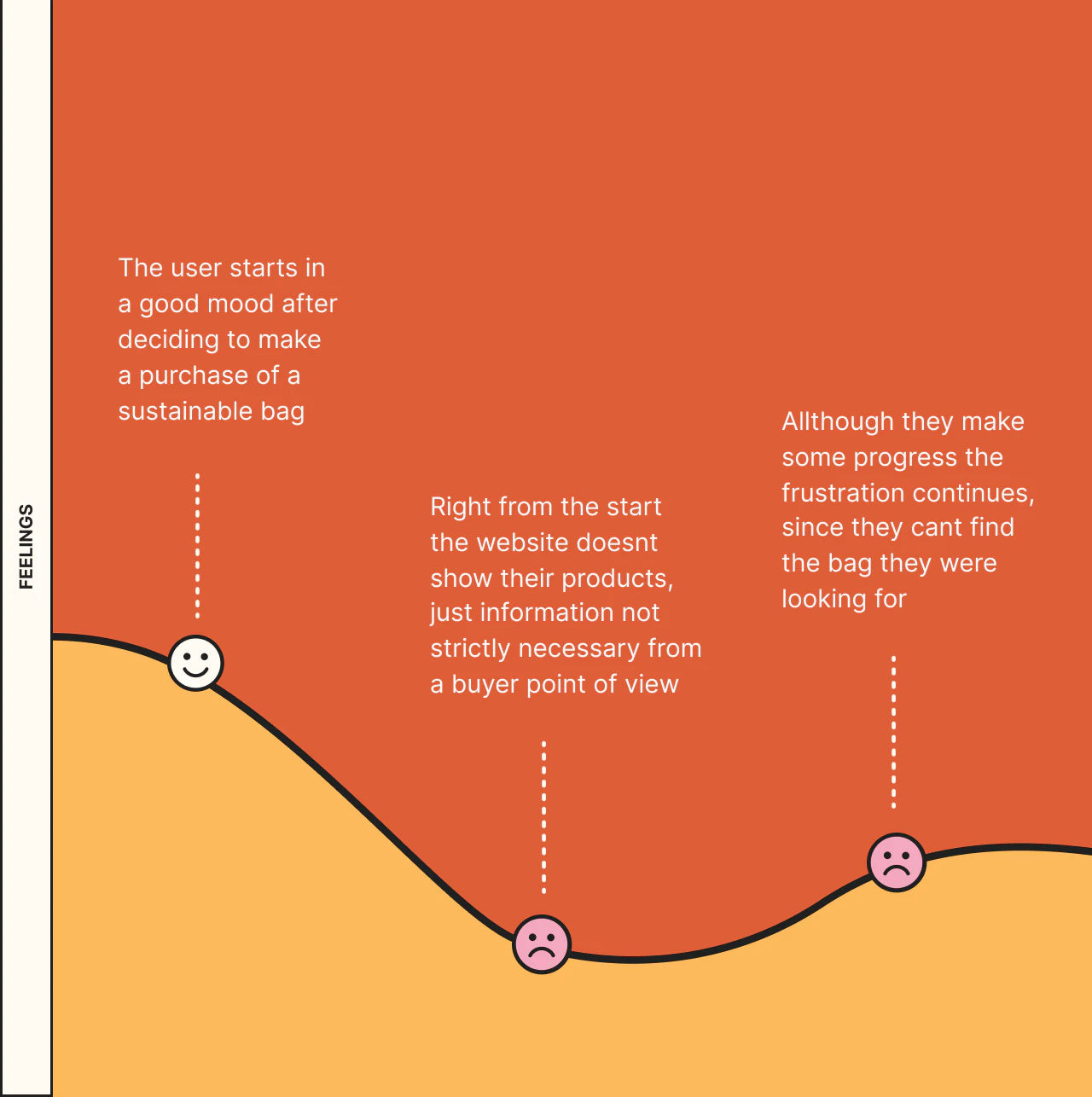
fig 04. User Empathy Map
Moving onto their main issue, it was really hard to find the brand’s core products, technology, and information. This was the major influence in the frustration the users were facing while trying to make a purchase or learning more about the brand’s mission and values.
We discovered that over 50% of the most relevant information the brand shared was just thrown into one very large page, it was hard to read, easy to miss and also boring to see.
Some other issues we found were: repetitive sections, lack of focus in the main products, categories and content being overlapped, and links that took you to important places being hard to find. Also the prices of the products and photography weren’t matching the aestethic of the site.
Our audit and research concluded that these issues had to be affecting main company areas, a drop on the conversions, retentions, but most worryingly on the overall sales.

fig 05. Starting Navigation
Focusing on what matters
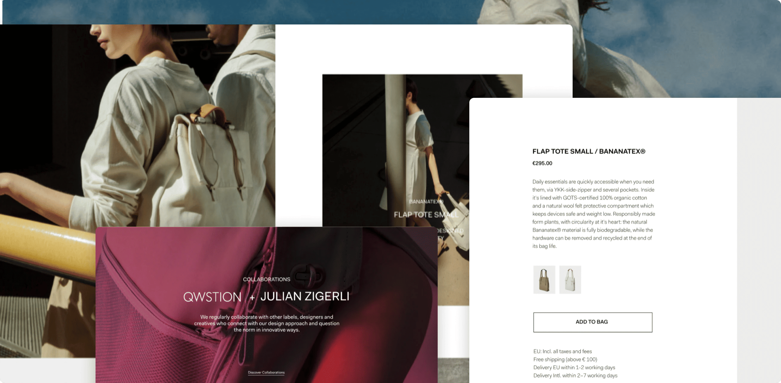
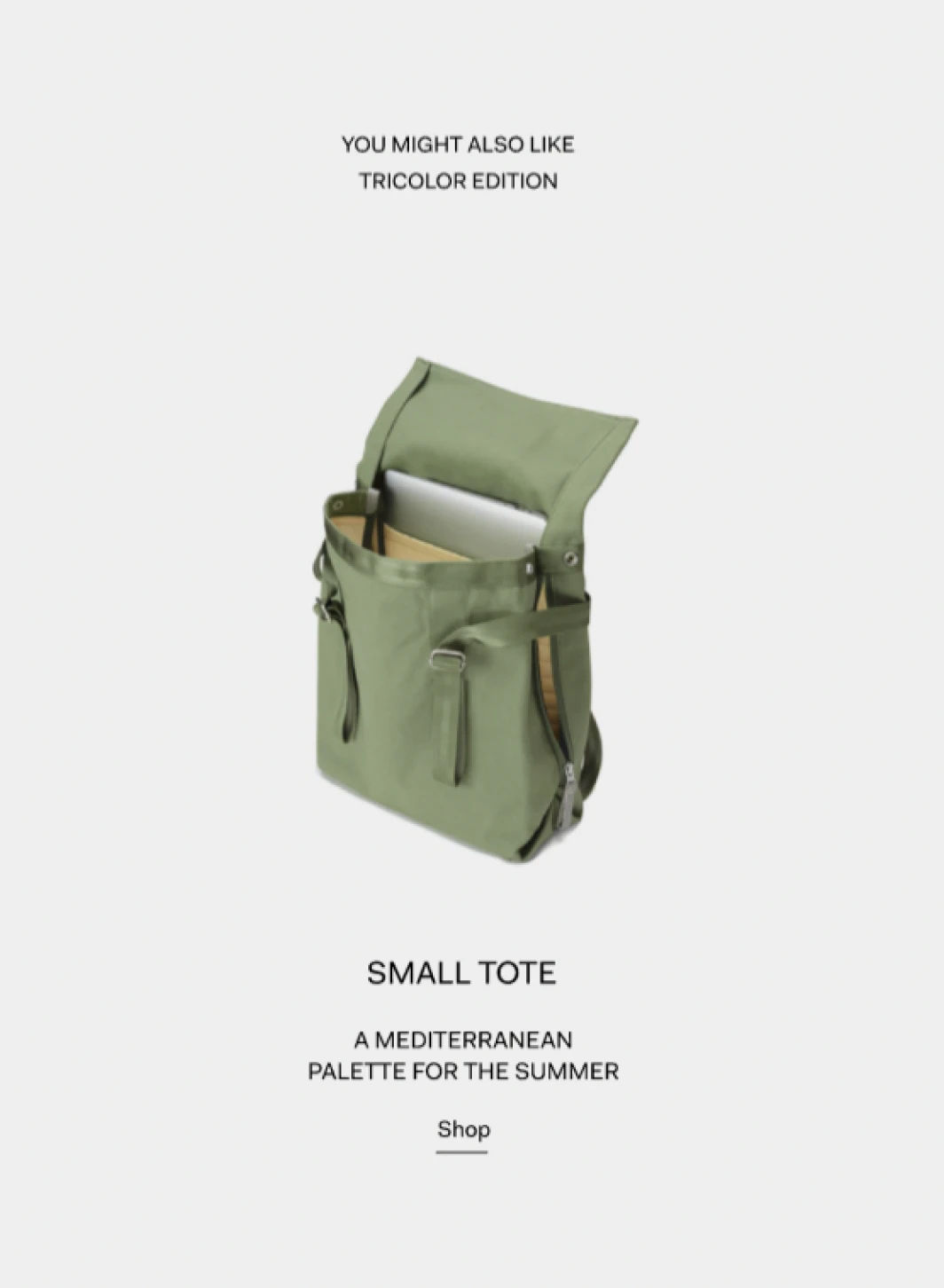
Having your product hihghligthed in your webiste’s hero page is something that you always should look for. In this case, there wasn’t a clear showcase of the brand’s selling products; they were inside layers of shopping pages and hidden categories.
We proposed a striking photo of their catalogue accompanied by some of their main properties. We also used a typeface that communicated impact and innovation . The following sections were a tour through the brands most important aspects, such their main collection, seasonal, sustainability and collaborations. This way just on the home, the users could reach any category they liked.
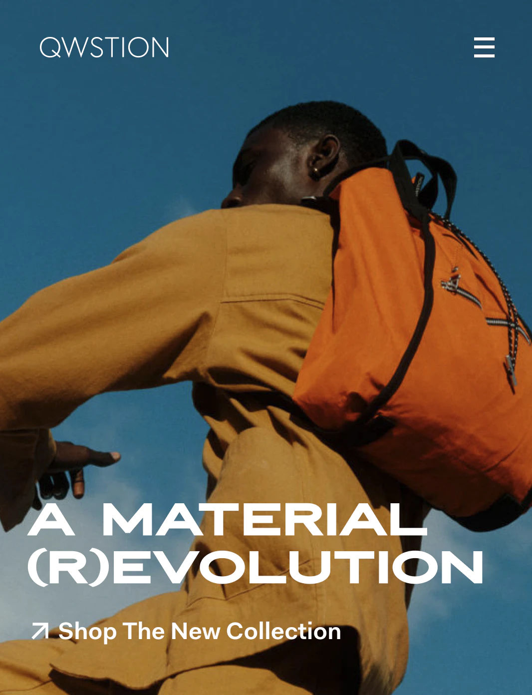
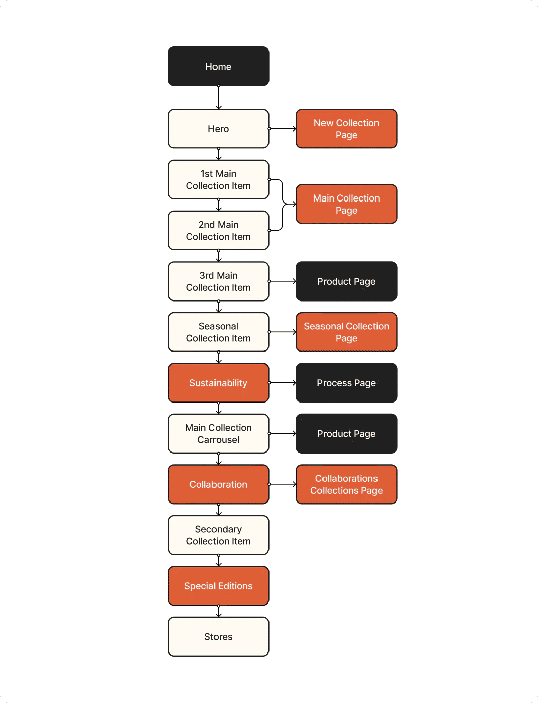
fig 06. Redundant Links
fig 07. User Empathy Map
No matter how noble and great our product might be, communication will always be key.
From this project we learned that you can be an absolute fan of a brand, a project or a way of doing things, but if the brand never tries to reach you it will be hard for you to keep following them. The most important thing a brand has to do after making great products is to make their users lives easier in the way they can, even if it is on a website, it will really make a change.
Feel like this could be your brand?
LET’S TALK