Where every breath is a chance to grow.
The Mission
Breathology is an app focused on one of our body’s most fundamental acts: breathing.
The brand wanted to be set apart from their competitors by having an easy to use, clear and effective product that allowed users to relax and reduce stress, all by combining breathing exercises with guided sessions.
During our strategy meetings we defined the market, the users and what we were aiming for in terms of visuals. The outcome: A modern app with a focus on simplicity and user experience.
Services
Brand Identity / Strategy / Art Direction / Copywrting / Web Design & Development / Mobile App Design & Development
Website
breathology.io
@breathology

fig 01. Stylescapes
Setting the identity
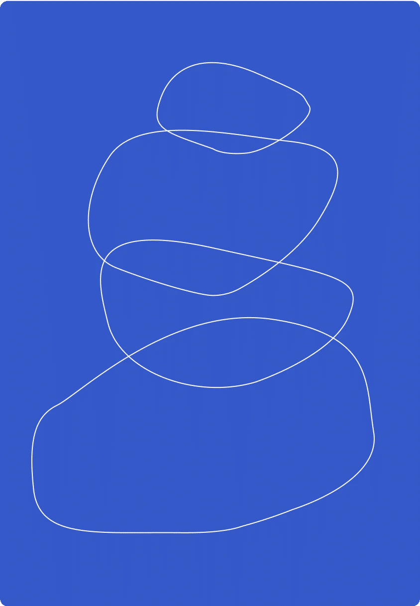
In the pursuit of mixing breathing with its benefits we elaborated deeply into movement and balance, we de-constructed the art of Stone Balancing, which as the name explains, is the meditative process of aligning stones one on top of the other to reach a zen state of mind.
Using these diverse shapes, we followed the road that a breath might take. Back and forth we merged these actions together into a single shape, the brand logo.

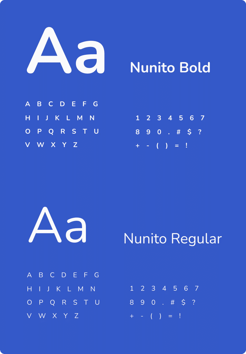
To follow the organic approach, we used the Nunito typeface with rounded corners, good legibility and a great variety of weights for digital environments.
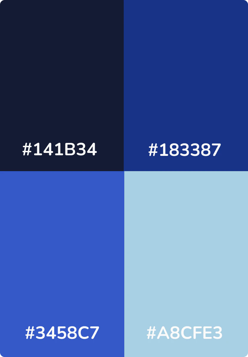
We also chose an analogous color palette, with shades of blue for evoking calm, relax and nature elements like the sky and the sea.
Going Digital
Research showed that the personas defined in our strategy sessions had something in common: they needed an app that could deliver results fast, that had no strings attached, but mostly that was ready to use anywhere, anytime.
Results was a big word in our sessions, we found out that a great portion of the users might be skeptical, and needed proof to stay in the app.
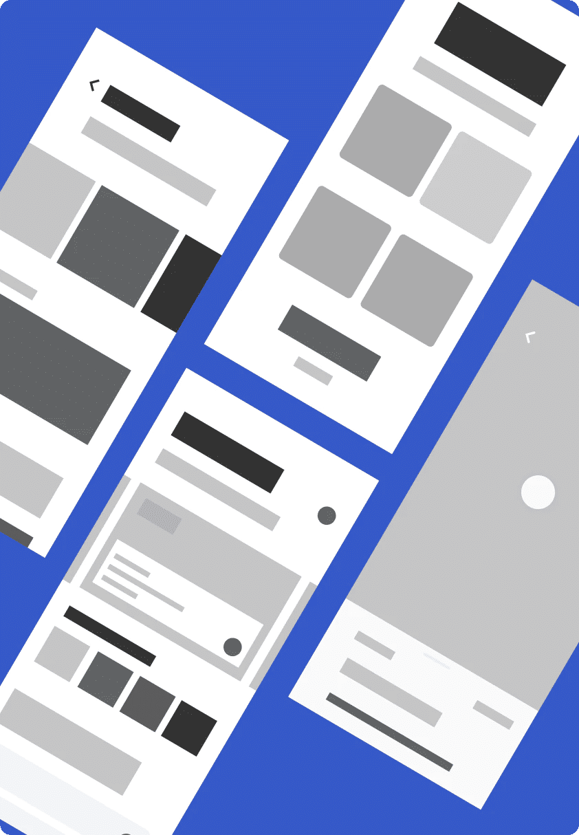
Because of this, we included feedback and motivational content that would keep them engaged and allowed them to feel empowered at the end of each session. We also added a tracker of their feelings so they could see the results over time.

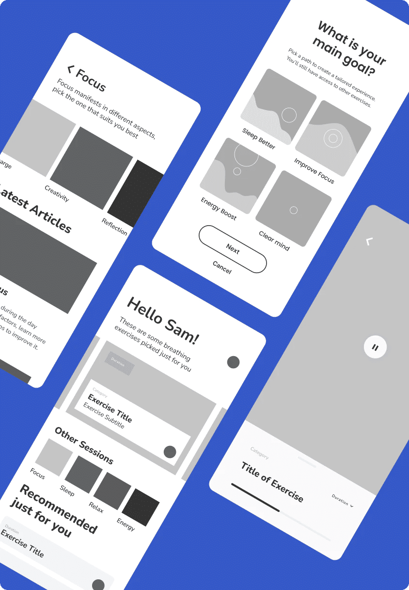
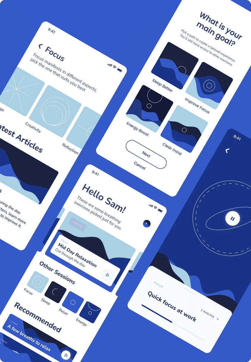
Another treat users had in common is that they didnt want to feel let down. They needed to be able to prove to their family, friends and clients that these suggestions were backed up with real data or scientific research.
This is why in our designs for communications and complimentary content, we encouraged the brand to teach and show their data and deliver it from the professionals themselves even to make their users feel safe.
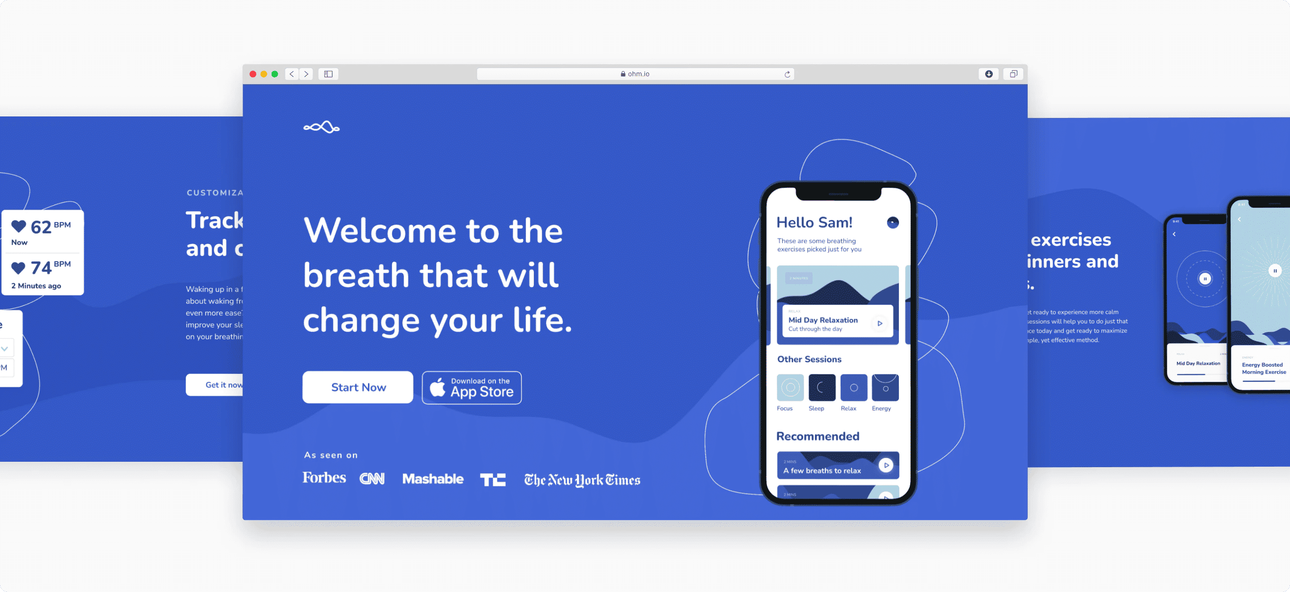
Breathing just got ultra powerful
A journey of self discovery. We learnt about our clients, and we learnt about ourselves.
In a sea full of distractions, we all need something to reduce stress, overthinking and anxiety. It’s not every day that we get to also be the users of the things we develop. For us as a team this was a great way to learn and improve our lives, one breath at a time.
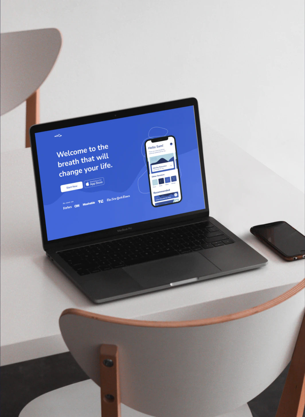
Feel like this could be your brand?
LET’S TALK